
How to Leverage Power BI’s Decomposition Tree Visual For Ad-hoc Reporting Needs
The business world is highly dynamic and there’s a growing demand for ad-hoc reports to enable business executives make critical decisions.
BI Developers are hired with a vision to build a reporting repository for use in the long-term. However, they usually end up spending a lot of time building ad-hoc reports on demand.
Fortunately, Power BI has introduced the Decomposition Tree visual. The visual is used to analyze the impact of various dimensions on a metric. This visual is a great time-saver for BI Developers as it enables them meet ad-hoc reporting needs (while enabling the users uncover insights themselves) in a much faster turnaround time!
Sounds great, doesn’t it? Let’s take a look at how the Decomposition Tree visual works.
First things first, the Decomposition Tree visual is currently available as a preview feature. So you’ve got to enable the feature in Power BI Desktop by navigating to File > Options and Settings > Options > Preview Features and check the Decomposition tree visual box and click ok.
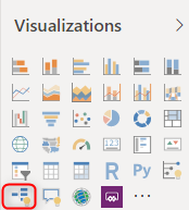
Then close and open Power BI Desktop. Now can you see the Decomposition Tree visual (highlighted in the below image) in the Visualizations pane?
There you go!
The Sample Data used for this tutorial is the Financial Sample Excel workbook from Power BI. Connect to this workbook in Power BI Desktop. Select the Decomposition Tree visual from the Visualizations pane. Now you can see the 2 buckets – Analyze and Explain by.
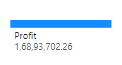
Drag and drop a metric, say Profit, into the Analyze bucket. Now a horizontal bar will be displayed in the visual, showing the aggregate of profit.
Now place the dimensions (that could have a significant impact on the metric analyzed) in the Explain by bucket. In this tutorial, the dimensions Year, Country, and Discount Band are factors that influence Profit, and so they should be placed in the Explain by bucket.
After creating the visual, it can be published or shared with stakeholders. The Developer’s job is done here. Yes, you’re reading it right! The rest of the blog post covers how the stakeholders such as executives can interact with the visual and uncover insights.
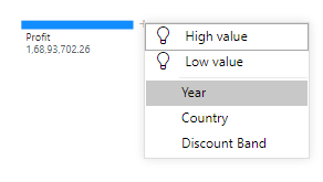
A + sign will appear near the bar representing the Profit in the visual. Clicking the + will list the set of factors placed in the Explain by bucket, along with 2 other options – High value and Low value. This High value and Low value are Artificial Intelligence(AI) options, that will automatically choose and breakdown the factor contributing to highest or lowest profits. For now, let’s directly choose the Year option.
When choosing the Year option, the visual will breakdown the profits based on the years, as seen in the below image.
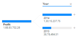
The visual now shows 2014 as the highest contributor to the metric, and 2013 as the lowest, and compares the two years. This also throws a quick insight that the profits surged in 2014 compared to the previous year. If there were more than 2 years, they will be sorted from highest contributor to lowest contributor by default.
Enjoy hassle-free visualization of OBIEE data in Power BI. Connect OBIEE/OAC/OAS and Power BI with the Power BI certified BI Connector.
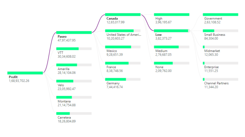
Now let’s further breakdown the year 2014 based on the countries contributing to the profit in that year, by simply choosing the + near the 2014 bar, and choosing country in the factors listed. Then the visual will appear as follows:
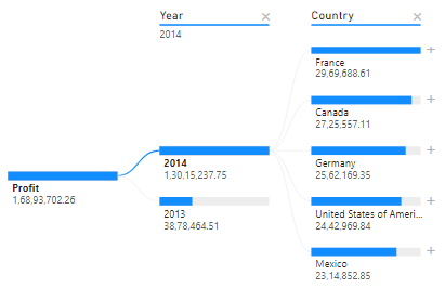
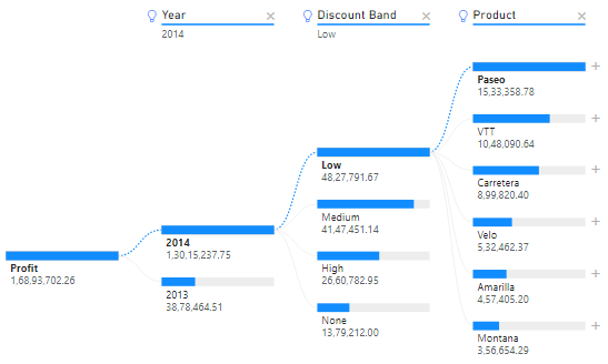
The insight is that France is the major contributor to Profit in the year 2014. Now let’s uncover the Discount Band by choosing that factor by clicking the + sign near France.

The Medium Discount band has contributed most profits from the French market in 2014, closely followed by the Low band. Interestingly, the high discount band has contributed the lowest profit. This uncovers the insight that the medium and low discount bands are a hit in the French market.
But hang on! What if Product, Segment, Month are added as factors? We’re stopping the tutorial here. Add these factors and try interacting with the visual yourself!
One last info – If the connectivity between the metrics and factors is a solid line, the factor was manually chosen by the user. If it is a dotted line, the factor was chosen by the AI Options (High Value or Low Value) as in the below image.
Want to try the Decomposition Tree visual on your OBIEE Subject Areas and Reports? Try BI Connector!