
April 19th, 2024
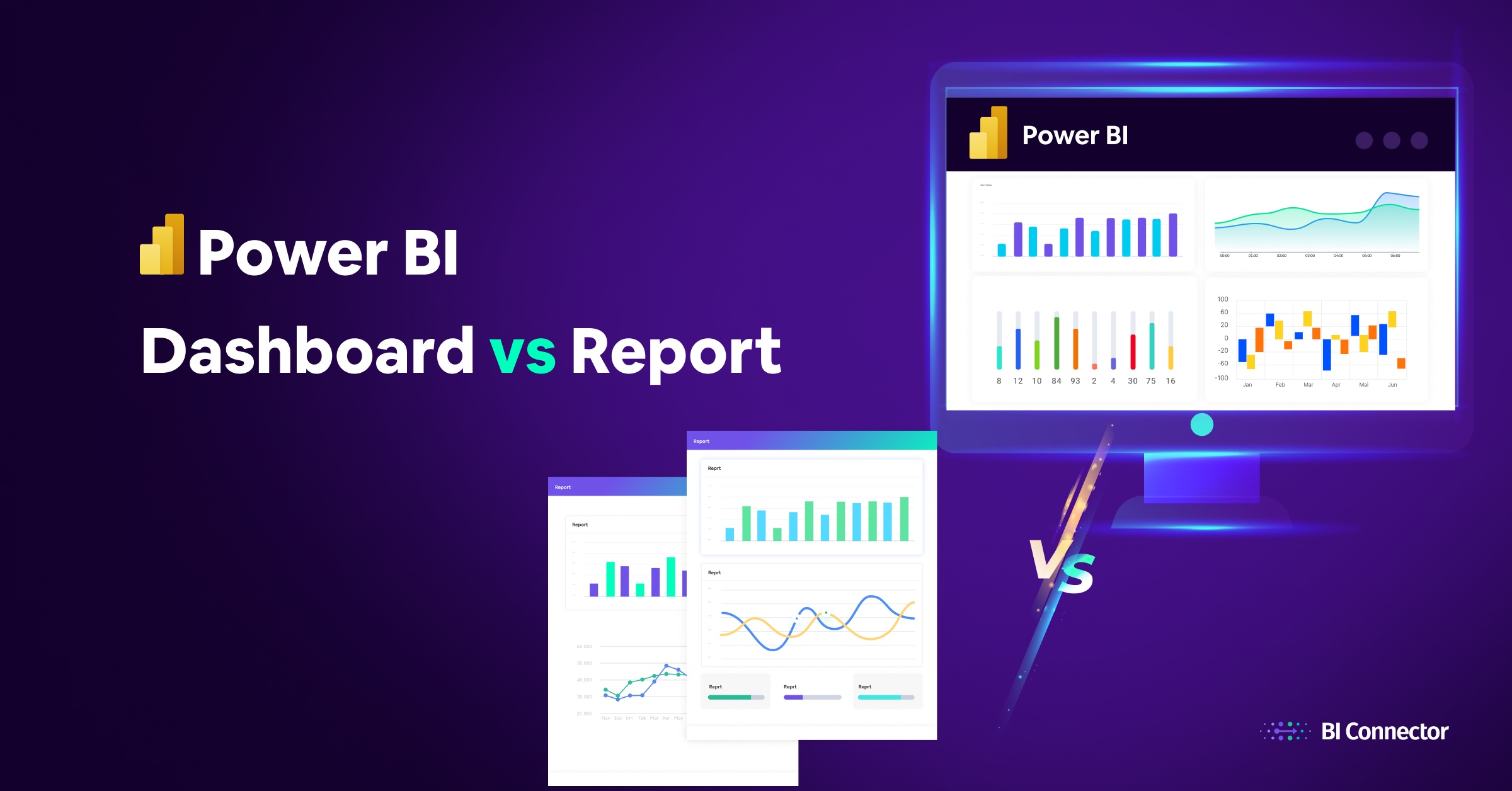
Power BI Dashboard vs Report
Microsoft Power BI, the industry-leading business intelligence platform, has emerged as the data solution of choice for companies globally. With over 115 million users and a growing user base, Power BI has fundamentally changed how organizations visualize, analyze, and share data.
In today’s article we tell you the difference between dashboards and reports. Though both are crucial components of data analysis within Power BI, they serve distinct purposes and are equipped with unique features tailored to meet different analytical needs.
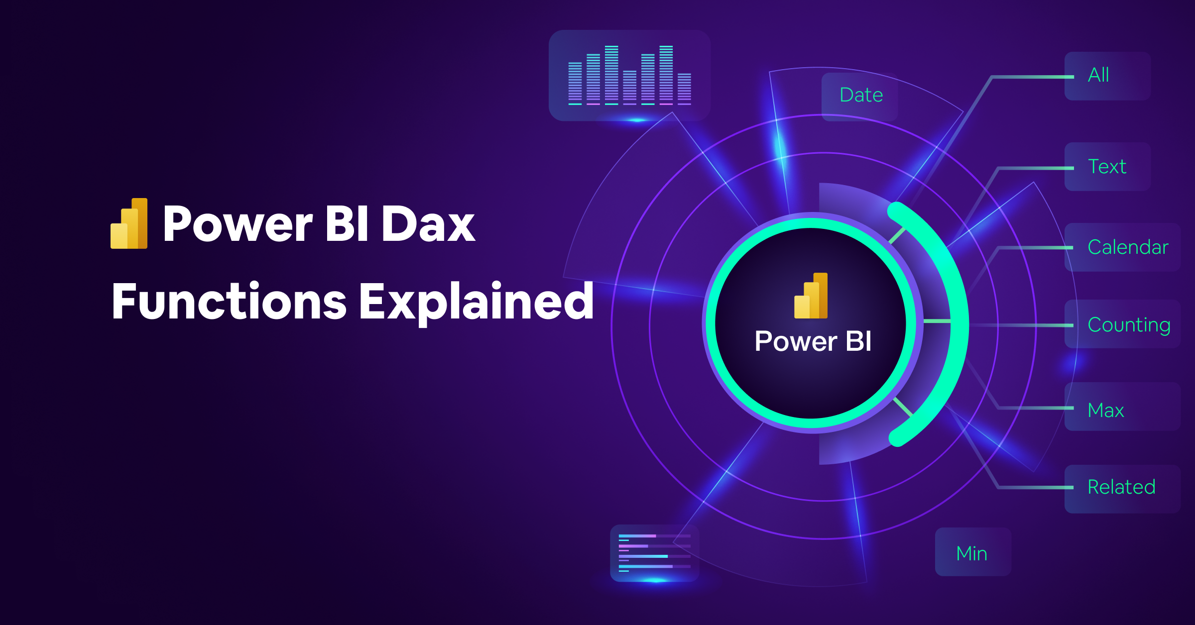
What is Power Bi?
In short, Power BI is a Microsoft tool designed to assist users and organizations in analyzing and interpreting their data. It allows you to connect to many different data sources, such as Excel spreadsheets, databases and online services, and then turn that data into easy-to-understand reports and dashboards. This means that users can view their data in many forms, such as charts, graphs and tables.
The goal of Power BI is to make an organization data-driven. You can create visual elements such as pie charts, bar charts and many more to analyze data in detail. It also allows everyone in your company to access this data. Therefore, Power BI provides the tools to bring data to life and help everyone understand what the numbers mean, making it easier to make decisions based on real information. Check out our article on Tableau vs. Power BI to learn more about this tool.
What is a Power BI Dashboard?
General Definition
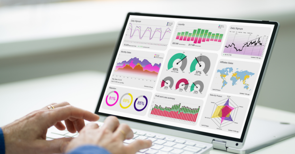
A Power BI dashboard is a single-page visual display that aggregates key performance indicators (KPIs) to provide a high-level overview of data at a glance. It’s crafted to monitor and track key metrics, thus facilitating the presentation of data to executives and decision-makers in the form of concise and crucial information summaries.
Purpose of Use
Dashboards in Power BI are essential tools for offering a snapshot of KPIs and data insights. They are instrumental in the real-time visualization of business operations, performance, and trends, making them invaluable for quick, informed decision-making processes. With the ability to connect to various data sources, including databases, cloud services, and streaming data, dashboards ensure that the information displayed is always current, thereby providing up-to-date insights.
Key Features
Tiles
Tiles are the core components of a Power BI dashboard, representing individual data visualizations like charts, tables, and maps. These tiles are pinned by report designers to the dashboard from reports, where selecting a tile often navigates the user to the report page where the visualization originated.
Real-time Data
A critical advantage of Power BI dashboards is their ability to display data in real-time or near-real-time, enabling continuous monitoring of performance and KPIs. This feature ensures that users can track the immediate effects of business activities and make adjustments as necessary.
Customizable Layouts
The flexibility to customize the layout, theme, and style of the dashboard allows users to align it with their organization’s branding. This customization extends to fixing certain filters or visual elements, enabling developers to tailor the dashboard experience for a specific set of end users.
Single Page for Simplicity
The limitation to a single page ensures that only the most crucial elements of the data story are presented. This helps in maintaining the dashboard’s focus and aids users in quickly understanding the overall performance of the business.
Interactivity
While dashboard interactivity is intentionally kept to a minimum to maintain simplicity, Power BI dashboards still offer functionalities like the Power BI Q&A field, enabling users to ask questions about their data directly within the dashboard environment.
Alerts and Notifications
Dashboards uniquely support the creation of email alerts based on specific conditions. This feature allows users to stay informed about critical metrics and thresholds without constantly monitoring the dashboard.
In essence, Power BI dashboards serve as a streamlined, at-a-glance tool for data analysis and decision support. They are designed with the end user in mind, ensuring that whether the dashboard is viewed on a computer monitor, a mobile device, or during a presentation, it conveys the intended insights effectively and efficiently.
Through a combination of real-time data updates, customizable visual elements, and focused data presentation, Power BI dashboards empower users to maintain an overview of their business metrics and make data-driven decisions promptly.
What is a Power BI Report?

Overview
Power BI reports offer a detailed, multi-perspective analysis of data through a collection of visuals on one or multiple pages. These reports provide an in-depth look at data, enabling users to focus on and explore specific details further than what dashboards allow.
Purpose
The main goal of Power BI reports is to deliver comprehensive insights from complex data sets. They enable users to transform, clean, and connect various sources of data into interactive visuals, like charts and tables, for a deeper understanding and analysis.
Features
Flexible Structure
Reports can contain multiple pages, each dedicated to exploring different facets of the data, allowing for a thorough examination.
Interactivity
Users can interact with data through filters and visuals, making it possible to dive into the specifics and uncover hidden insights.
Semantic Model
Reports are built on a semantic model, ensuring a cohesive and interconnected data analysis experience across all visuals.
Dynamic and Customizable
The visuals within reports are dynamic, updating with the underlying data changes, and can be customized through templates and the Power BI Report Builder to fit specific analytical needs.
User Roles and Permissions
The access to interact with and explore a report varies, depending on a user’s role and the permissions granted by the report designer.
Power BI reports stand out as a dynamic tool for detailed data analysis, enabling users to explore beyond surface-level insights. With their ability to accommodate deep dives into data through a rich set of interactive and customizable features, these reports are crucial for those looking to make informed decisions based on comprehensive data analysis.
Power BI Dashboard vs. Report: Similarities and Differences
In Power BI, dashboards and reports are fundamental elements of data visualization. Although they share the common goal of making data understandable and actionable, their approaches and functionalities are different:
- Dashboards provide a quick and comprehensive view of data:
- High-level information on a single page.
- Consolidation of key metrics and KPIs for quick monitoring.
- Real-time data updates for continuous performance checking.
- Limited interactivity to focus on the summary.
- In contrast, reports allow for detailed examination of data:
- Offering comprehensive, multi-page analyses.
- Allow in-depth exploration with extensive interactive options.
- Focus on historical data, regularly updated to ensure accuracy.
- Support nuanced analysis through filters, slicers and multiple visual types.
Given these differences, the choice between a dashboard and a report depends on the user’s specific needs, whether it’s an immediate high-level view or a deeper, more granular understanding of the data.
To further clarify these differences and help users select the right tool for their data analysis tasks, we have put together the following comparison table:
| Feature | Power BI Dashboard | Power BI Report |
| Purpose | High-level insights. | Detailed analysis. |
| Design | Single-page, simple visuals. | Multi-page, complex visuals. |
| Interactivity | Limited, mostly viewing. | Extensive, with drilling and filtering. |
| Data | Real-time monitoring. | Focuses on historical, updated periodically. |
| Visualization | Summarizes key info. | Detailed examinations. |
| Connection | Multiple sources for overview. | Deep dive into specific sources. |
| User Role | For decision-makers. | For analysts and data explorers. |
| Visual Scope | Key metrics on tiles. | Wide range of detailed visuals. |
| Updates | Real-time or frequent. | Scheduled or as needed. |
| Accessibility | Across devices, quick insights. | Detailed sharing and collaboration options. |
Conclusion
In summary, choosing between a Power BI dashboard and a report really depends on what you need. If you want a quick look at your data or to keep an eye on things as they change, dashboards are great. They give you the big picture fast. But if you need to really dig into your data and understand it deeply, reports are the way to go because they let you explore every detail.
It’s also about who will use them. Dashboards are perfect for people who need quick updates, while reports are better for those who need to make sense of complex information.
Additionally, leveraging tools like BI Connector, which facilitates linking Oracle databases with Power BI, further enhances the capabilities for analysis and visualization. With a clear understanding of both dashboards and reports, along with effective connection tools, organizations can unlock the full potential of their data for informed and confident decision-making.